
Why You Should Be Using Automatic Reports
Time is money.
Every minute spent manually sifting through data and reports is costing your business money as you could easily be spending these hours in other productive ways.
Even if you aren’t spending hours (yet) minutes add up and turn into hours which turn into days, months etc. so no more! Starting today I’m going to walk you through how to run automatic reports for your website.
Advantages and disadvantages of automatic reporting
As I said, it saves you potentially hours of manually putting together reports every month. You get more time to reinvest back into your brand or perhaps even more vacation time, I’m not here to judge.
Not to mention the fact that it’s a computer algorithm means it can do it every day without fail if you want it to, providing your website with a virtually live sheet for your analytics.
This can have many positive repercussions for your company so why doesn’t everyone do it?
There are loads of reasons, some more valid than others but one predominant one is the initial hours you have to put in to set up the automated report.
This isn’t completely untrue however it can be done in less than an hour (with the help of yours truly) but also you have to recognise the long term benefits this could have and realise how heavily it outweighs the costs.
Another (less credible) reason is people believe they have been doing it manually so long that they are used to the process and are efficient at it, but you will NEVER be more efficient than a computer so why try?
Programs needed for automatic reporting
There are multiple programs you could use but for this, I recommend Google for its accessibility and relative ease of use.
- Google Sheets.
This is a Microsoft excel alternative, with its own distinct advantages over the aforementioned. For this specific task, the main advantage we’ll focus on is its integration with the next 2 programs.
- Google Analytics add on.
This is an add on you’ve hopefully already been using as it provides all sorts of data on your website for owners to use to develop and improve. Again, they’re not the only ones who offer this service but have unrivalled accessibility and ease of use.
- Google data studio.
This helps you turn the raw figures into useful infographics and graphs to make them digestible for yourself or possibly any stakeholders.
How to set up automated reporting
The first thing you need to do before opening any programs is to establish what data you want to see, as too much raw information can easily get overwhelming.
I assume you have a report format you already follow but in case you don’t, you should research it as it depends heavily on what your brand is. For example, a free blog will most likely be looking for different data than a retail shop.
Now we will open Google Analytics – it should lead to a fairly straightforward ‘wizard’ to help you set it up, in case you haven’t used it before that should look like this.
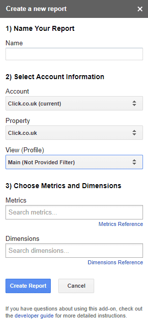
Source: Google
A few things of note is that you should use a clear and obvious name to avoid any complications down the line.
For the metrics and dimensions, use fairly small ones to start with. I’ll touch more on this later but don’t worry too much about this right now as you can always change it later on and add more as you get more comfortable, for now just tinker and choose a starting number.
After you fill everything in, click ‘create report.’ Then the following column alongside your report should appear.
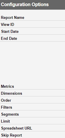
Source: Google
This is slightly more complicated but should still be manageable and just requires a bit of tweaking to fit your needs.
The top area should be fairly simple to fill in, but a neat trick is that if you want a daily report you can put =Today() to avoid having to repeatedly put in the date.
Metrics and dimensions are more complicated on the options side as there is a wide range to choose from and can be a bit overwhelming. The wizard should have some suggestions but once again this depends on your specific needs so to find the one that best suits you, you may need to do some online research or just play about with what you can see.
Filters help you to restrict data making it easier to focus on a specific subfolder or section.
Segment work similarly to separate data such as specific countries (if the website is global) or things of the same vein.
Limit is mostly for bigger companies but can help keep the report at a manageable number as opposed to rows and rows of disorienting numbers.
And that’s all for Google analytics.
Now for Google data studios, the hardest part is finding the most suitable visual aid as there is a lot of ways to present the data. Select ‘New Report’ and clearly name it.
Click ‘create new data source’ and this should take you to a range of possible data sources where you will click google sheets and look for your hopefully obviously named sheet.
Then choose the ‘connect’ option which should bring you a large range of options for all sorts of visuals that should look something like this.
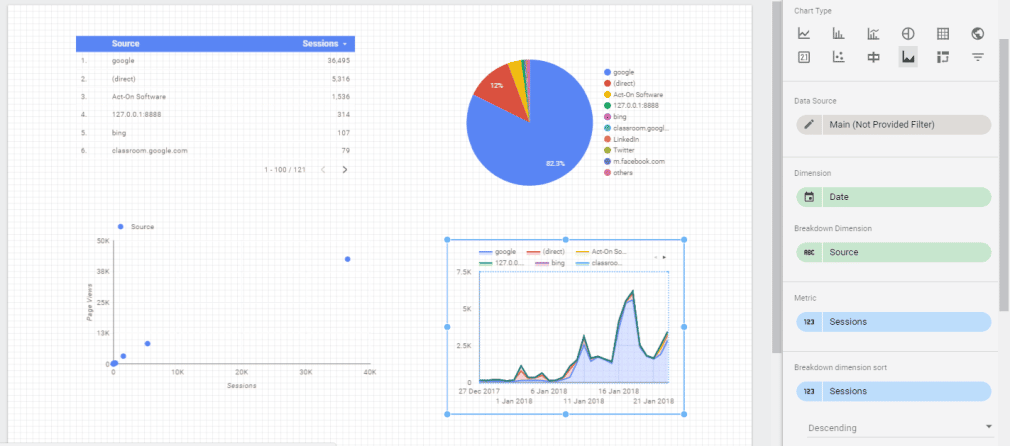
Source: Google
Final thoughts
Hopefully, this taught you how to automate hours of tedious work. Now go and enjoy the sight of more white squares on your calendar by making use of automated reporting.